

ADDITIONAL WORK
This is the area of my portfolio where I keep projects that either didn't move beyond initial artwork or were done getting my design degree. I believe in keeping your old work and revisiting it. I should call this section "Perspective". It is the area of my portfolio I can come back to in times of stagnation or pessimism, and see how far I've come. I think that's important for an artist (anyone in fact) to be able to look back on something and feel whatever feelings you have about those old pieces. Where were you? What was happening in your life when it was created? Where are you now? And how are you feeling now? These are important questions. I look at these and I still feel good about them, even if I've created better since.
ARTWORK | ILLUSTRATION | TYPE DESIGN | INDESIGN LAYOUT

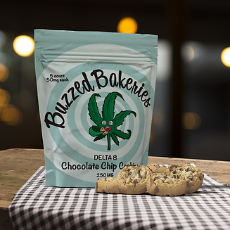
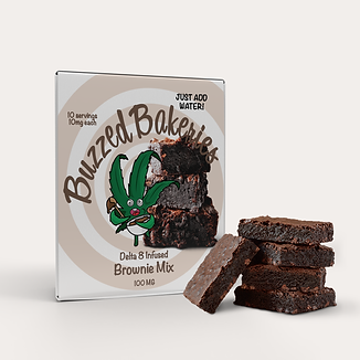
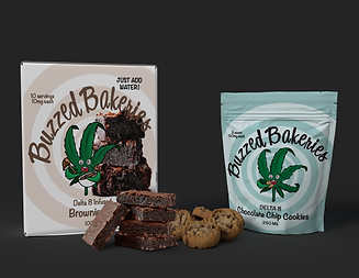
BUZZED BAKERIES
Buzzed Bakeries was a cannabis confectionary brand that was intended to cover various types of baked goods. The first in the product line was going to be the chocolate chip cookie, then it grew into a "bake your own all-in-one" brownie mix.
This project didn't move passed the initial artwork and packaging phase. However, I really enjoyed the artwork I created. I feel that it had so much potential to become a brand that would stand out on a shelf in a cannabis shop.


ALLEVIATION Rx
Alleviation Rx was a CBD topical pain relief. The brand was to cover both a cream and a roll-on serum for over-the-counter pain relief. After a lot of time doing market research into similar products (both with and without CBD), I played around with naming and settled on Alleviation Rx. It felt both professional and unique. The client initially desired a minimal and sleek look and feel, a preferred a black and orange color palette. While this project never moved forward, I really liked the clean, higher end feel.

THE BLACK KEYS CONCEPT TOUR COLLATERAL
This set of items was created while obtaining my Graphic Design degree. We were tasked with creating branding collateral for a band and their hypothetical world tour. The parameters of the project had us creating the standard set of items for the band (i.e. compact disk artwork, a poster for the world tour, VIP passes, etc.) and choosing a specific era of artwork. I decided to use old Soviet era propaganda. The use of bold colors like red and black, along with typical images of flying aircraft and marchers, highlight the style.
This project used numerous programs (i.e. Adobe Illustrator, Photoshop, InDesign, and Dimensions) in order to create branding that flows seamlessly from one item to the next.
COLOR TREND REPORT


I was asked by the Creative Director to assist her in creating a main page template for the Color Trend Report she produced every year. First, I created grayscale ideas to show as many concepts as possible. This was great practice for creativity! It allowed me to focus fully on creating composition utilizing just shapes and text. Once this field of grayscale images was narrowed down, I was then asked to take an actual color swatch and place it onto the designs. This allowed us to further narrow down the choices. From this point, the final three had a secondary page added to showcase the eventual swatch’s various shades, along with other colors that are intended to be used as contrast or accents.